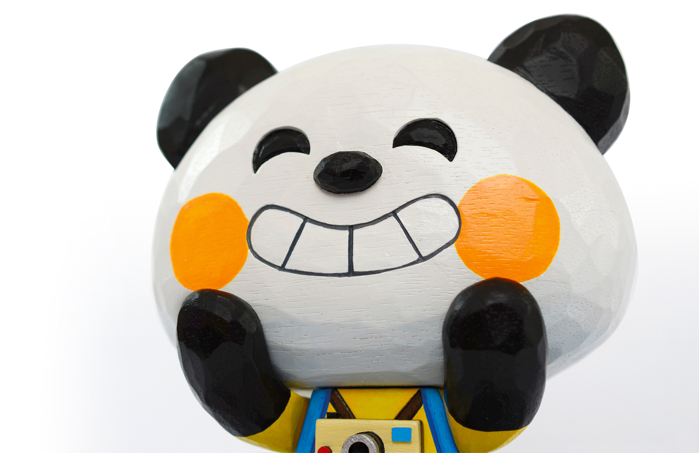
We like Nick Deakin’s illustrations. A lot. We like their clean lines, their boldness and their simplicity. We even like his rude drawings of little men made from little penises – but we hide them away when the in-laws turn up. We like that when Nick came to visit our studio he brought his own biscuits (value Hobnobs, in case you were wondering).
Sheffield folk will recognise Nick’s work if they've ever drunk in Public, the Great Gatsby or Picture House Social, whose walls, posters and menus are decorated with his work. Nick has worked with the lovely folk at Artfelt to bring a burst of cheer to a corner of Sheffield Children's Hospital too. His friendly, instantly recognisable characters and designs decorate the orthoptic department, surely making the whole hospital experience much nicer for the patients and their families. On top of that he has an enviable international client list, including Nike, The Guardian, Coca Cola and The New York Times.
Take a look at Nick’s work and prepare to make room in your house for another screen print.
How would you describe your work?
Simple, bold, sometimes irreverent, occasionally irrelevant. I seem to be moving and diffusing into pattern and line recently too, at least in my personal work. I’m developing this dichotomy of simple shapes and characters, and dense complex patterns.
What inspires you?
Print, texture, type. The smell of summer, the sound of a stream, a hug.
What’s your workspace like?
I share a studio with Lord Bunn; we have a lovely space by the river at Kelham Island.
What do you love about Sheffield?
It’s a great cosy city with a busy community of creatives, and it’s super close to the hills, so if you do want to escape the buildings and hubbub it doesn’t take long to lose yourself in the Peak District.
What would you do to improve the city?
A little bit warmer please.


