This website uses cookies. Read more about our cookie/privacy policy.

Accept and Close

The Sheffield culture guide written by in-the-know locals

SIA's Visual Communication students

Tom Saxton – Flakey Mile: A Greasy Guide of Sheffield’s Greggs

In late 2017 the Visual Communication team from the Sheffield Institute of the Arts (SIA) at Sheffield Hallam University (SHU) invited our creative team to work on a module with first year students that asked them to map the city using a theme that interested them. With most of the students new to Sheffield, the project encouraged them to explore their new home and discover some of Sheffield’s interesting nooks and crannies. The maps could be based on whatever took their fancy. They did not disappoint.

We were inundated with excellent ideas and themes that we’d never have thought of in a million years. Shoes of Sheffield. Smells of Sheffield. Death Metal Map of Sheffield. With around 150 students on the course, the list really does go on. The ideas were funny, charming, surprising and incredibly imaginative – and they taught us a fair few things about the city we thought we knew inside out.

We’ve included a few of our favourites here, but really this list could have been five times as long. Its so heartening to see a new generation of curious and talented young folk learning their craft here in Sheffield. Hopefully they’ll stick around after their time at SIA and make a home in our lovely creative city.

You shouldn’t have favourites, I know, but we were totally charmed by Callum Bridge’s Generational Gap Map. Callum’s Dad, Gareth, studied in Sheffield almost 40 years before Callum, and his map looked at their differing experiences in the city through the prism of Sheffield’s social and political changes. Full of memories and stories from father and son, the Generational Gap Map is an incredibly personal look at what the city meant, and means, to Callum and his dad, and we loved getting a peak into their Sheffield world. It looks great too. Callum also made a short animated film about public transport during his dad’s time in Sheffield to support the project.

Visually, we adored Max Armstrong’s The Faces of Sheffield. Observing the facial expressions of people in four areas of Sheffield Max created a map that represented the different atmospheres he felt in these places – from happy to sad, bored to angry. According to Max, we should all be hanging out around Devonshire Green, which saw the biggest concentration of happy faces. The simple, graphic execution of The Faces of Sheffield is a visual treat – top marks, Max!

Callum Bridge – Generational Gap Map

Max Armstrong – The Faces of Sheffield

Hollie Clarke’s Hidden Above Sheffield was another super imaginative visual treat. Taking inspiration from light pollution across Sheffield, which makes most stars practically invisible to people in the city below, Hollie created a map to raise awareness of the beauty in the skies above Sheffield. The map housed a planetarium with laser cut constellations for users to unfold and hold up to the sky, with instructions for when these constellations can be seen in Sheffield. A total treat.

Megan Tompkins's Who is Sheffield? was a real eye opener for us. Listing inspiring people born or bred in Sheffield, I’m embarrassed to say we’d only heard of a few. Megan described them as "incredibly uplifting to discover" and we felt exactly the same – and felt that little bit prouder of our city as a result.

Hollie Clarke – Hidden Above Sheffield

Megan Tompkins – Who is Sheffield?

The map that made us chuckle the most was Hope Spalding’s Shoes of Sheffield. Taking inspiration from the different types of footwear she saw on walks around the city, Hope's map encapsulates the spirit of the city through the shoes Sheffielders choose to wear. Hope looked at the upkeep of the shoes, whether they were day or night shoes and how they were fastened. She also assigned fictional stories for each type of shoe, imagining the personalties of their owners. Original, hilarious and beautifully executed, for us Shoes of Sheffield perfectly sums up our city's individual and unique personality.

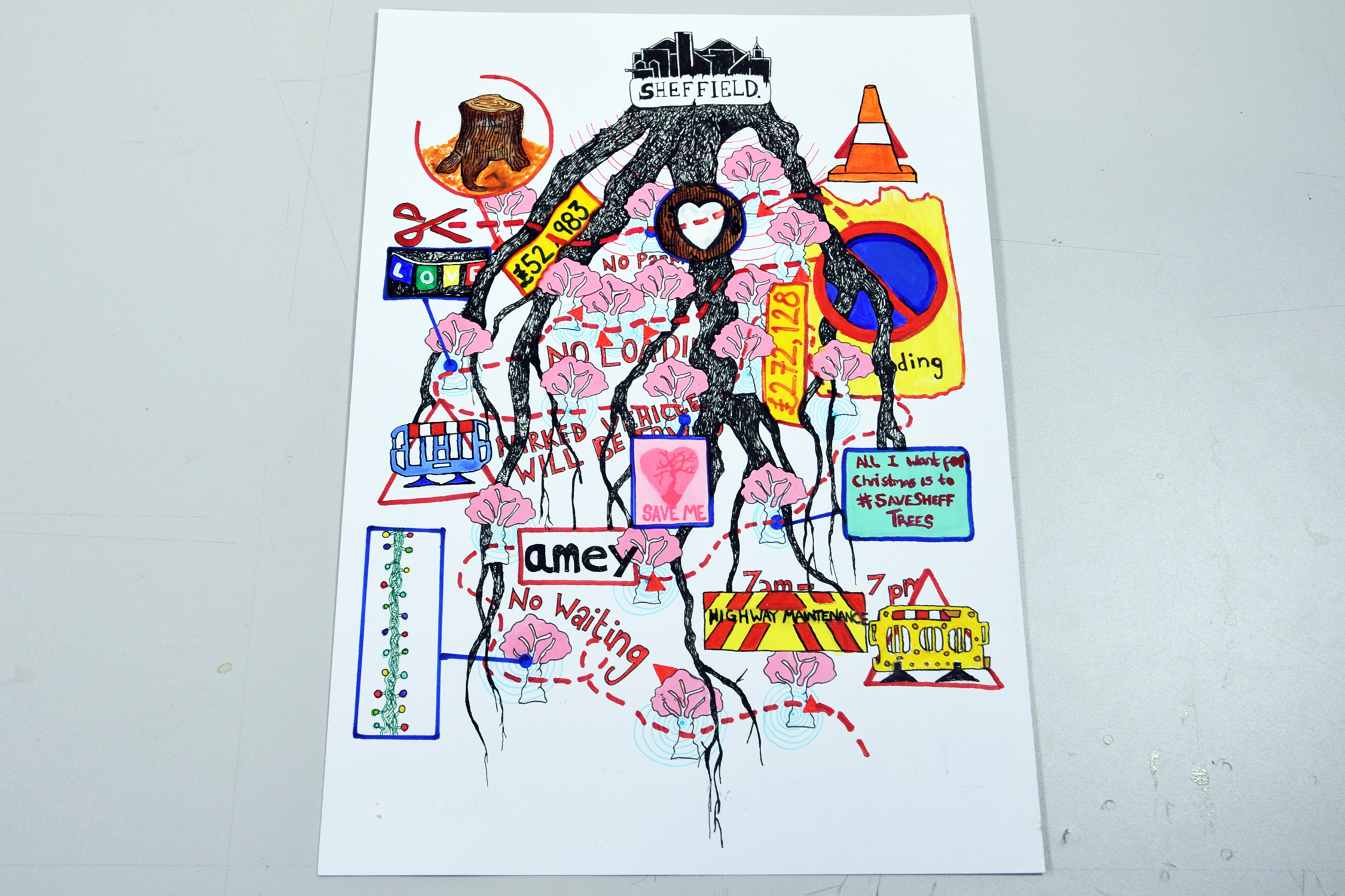
How could we not mention the trees? Eliot Robinson’s The Roots of our City maps the senseless destruction of Sheffield’s street trees, focusing on the battle between residents of Abbeydale Park Rise and Amey. Eliot’s map, designed as an envelope ready to deliver to Sheffield City Council, portrays the animosity between contractors, councillors and residents in a beautiful and thoughtful way.

Hope Spalding – Shoes of Sheffield

Eliot Robinson – The Roots of our City

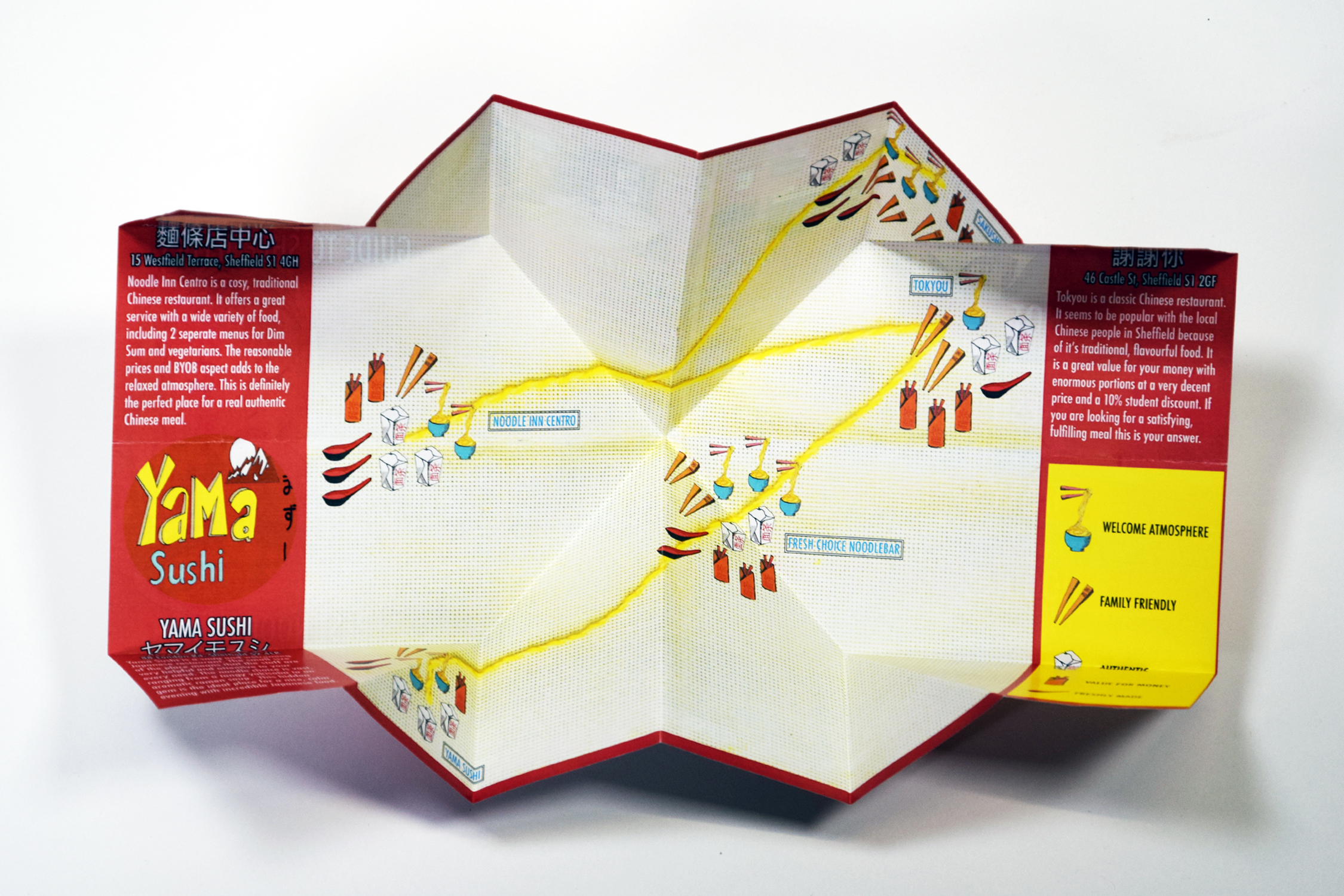
There were a fair few food themed maps in the final submissions, but these three stood out for their take on Sheffield’s culinary offering. Jodie Quinn’s map of Sheffield’s Best Noodles took us on a visual journey around the city’s Chinese and Japanese restaurants that folded into a typical noodle carton. Meanwhile Stephanie Dowd’s Food Intolerance Tour of Sheffield was a response to Stephanie’s need to find places in the city that catered for her food intolerances and her desire to share the information with others. Different intolerances are colour coded along with suggested meal plans, so that users can enjoy a variety of dishes in places around the city. Folded like a napkin, and packaged with a disposable knife and fork, it's a really thoughtful and accomplished guide. Lastly – and this one made us laugh out loud – is Tom Saxton’s Flakey Mile: A Greasy Guide of Sheffield’s Greggs. Tom initially intended to create a map depicting the number of Greggs in the city centre, but after discovering that every mealtime was covered by the chain he widened the project to look at the potential health risks of eating breakfast, lunch and tea at Greggs, including a calorie menu alongside a series of dystopian descriptions of the different menu items. Funny. With a greasy edge.

Jodie Quinn – Sheffield’s Best Noodles

Stephanie Dowd – Food Intolerance Tour of Sheffield

If we had more room we could have included tons more of these marvellous maps. It was such a pleasure for us to help out on this project, and we can’t wait to see what these talented young folk turn out next.

To see more exciting and creative projects from students at SIA head to the Old Head Post Office from 9 to 22 June when the degree shows are on. Spanning graphics, illustration, photography, fashion, product design, fine art, architecture and more its a real treat to see the first class work coming out of the Uni, and our city. It's a great opportunity to get inside the old Post Office too and see the incredible transformation SHU have made to this beaut of a building. See more information and visiting times.

You might also like...

TADO

Welcome to the wonderful world of TADO!

David Mellor

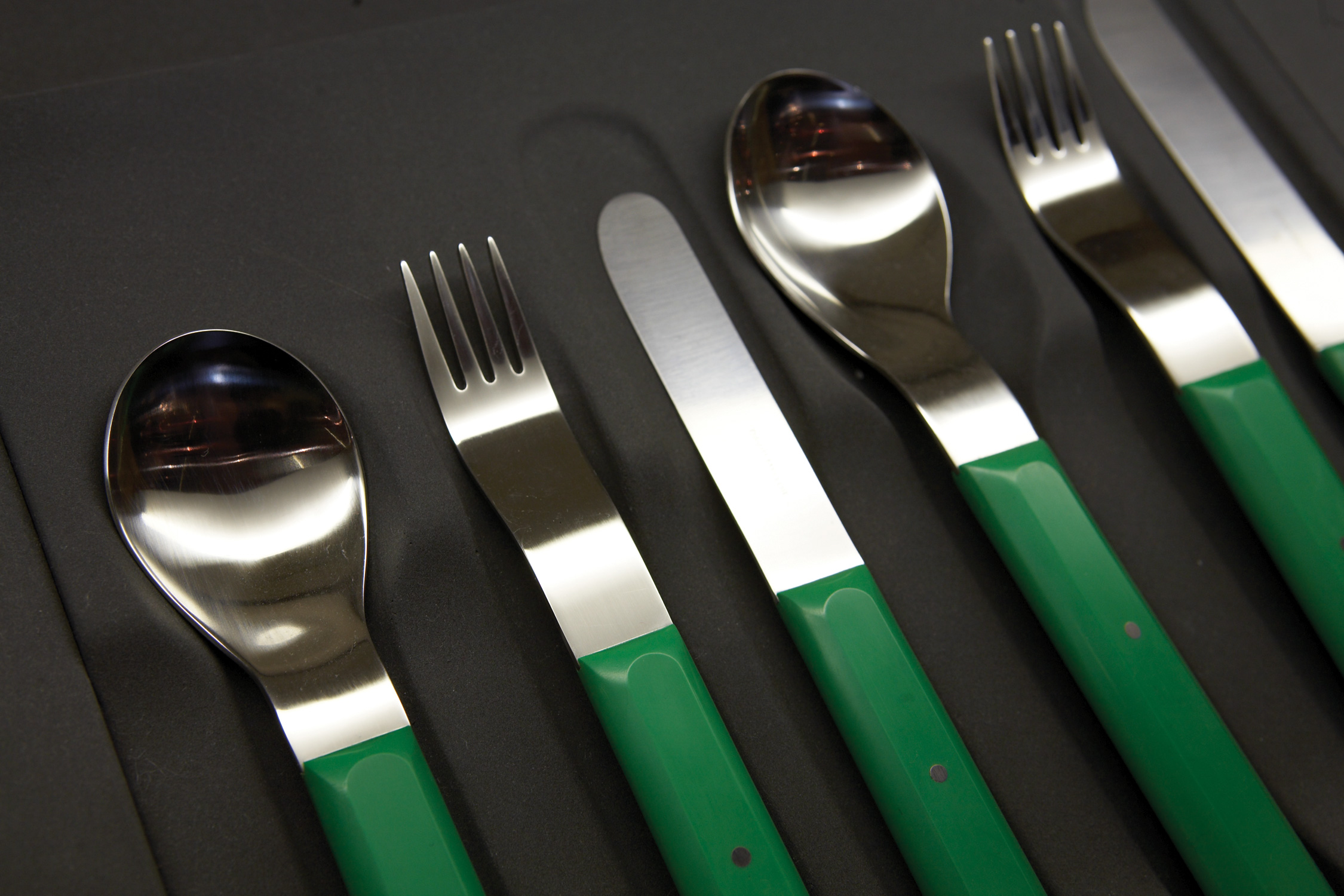
The so-called Cutlery King, who also designed traffic lights, park benches and 1960s bus shelters.

From Works

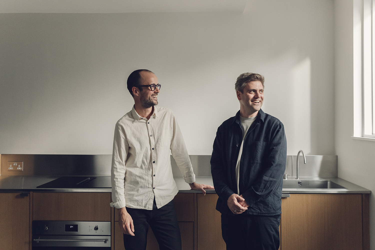
An architecture and design duo, searching out both inspiration and material in the city and its neighbouring Peak District.

Frazer Hudson

The witty illustrator lets us in on his way of working, his inspirations, and his thoughts on the 'quite zen' city of Sheffield.